
by Aaron Lightfoot, Comic Columnist
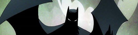
Batman #50:
Written by: Scott Snyder
Art by: Greg Capullo and Yanick Paquette
When it comes to creative teams, no other duo seems as universally appreciated as the duo of Scott Snyder and Greg Capullo. Their iconic work with Batman is considered one of the best ever. With this fiftieth issue for the Caped Crusader, we get to see the last issue with this incredible duo behind the reigns and it didn’t disappoint.
Finally bringing Bruce Wayne back into the role as Batman you get to see him, with the help of the Batmen – a police force using batman robots – try to take on the devastating Mr. Bloom. What you get is a very satisfying end of a story arc. The story was written to always keep you on the edge of your seat, and the art does wonders to compliment it. The art completely shows the warped reality that Mr. Bloom views as the future for Gotham. Everything comes to an end and in the most perfect way for the Man in the Cowl.
Rating: 9.5/10

Hawkeye #5:
Written by: Jeff Lemire
Art by: Ramon Perez
If a story suffers from a developing standpoint, the art must be able to keep the reader interested for the series to have a chance. The art isn’t able to do anything like that at all. The story suffers with incoherent flashbacks and inconsistency of the pacing. These issues, mixed with the lack of focus on the actual story arc, deter readers from being drawn to it.
The art is also a point in which the series suffers. It looks like it is half finished and even ifsomeone would be able to give it the benefit of the doubt, it hasn’t seemed to improve any at all across the five issues. The pastels used to show the time difference is a nice touch, but the lack of detail in practically everything means that not only is this series hard to read, it’s also hard to look at.
Rating: 4.5/10
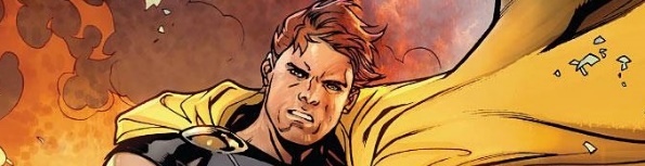
Hyperion #1:
Written by: Chuck Wendig
Art by: Nik Virella
Marvel is really trying to push the idea of Squadron Supreme. It feels like they are trying to show that they can put forward a team just like DC’s Justice League and do it better. Unfortunately, between the main series, Squadron Sinister from Secret Wars and the first issue of this series, it doesn’t look like the Justice League will be surpassed by them.
The art is very nicely done and is the lone showcase in the very basic story put forth. This issue doesn’t even seem to be all that much about its titular character. Trying to mimic the Superman story in which Supes tries to go undercover to understand the average person’s life, the issue misses by a bit. What is lacking is a sense of direction and control from the Superman-like character. Understandably, with this being the first issue there isn’t a lot to base it on, but it lacks the sustenance to make someone go back to it.
Rating: 6/10
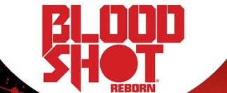
Bloodshot Annual #1:
Written by: Jeff Lemire
Art by: Kano, Joe Bennett, Belardino Brabo, and Jay Fabares
Annual issues of stories always seem to be one-shots. It takes a deeper look into the character, due to its oversized format. Luckily, Lemire is able to stray away from the norm in order to tell a fairly good, albeit very overused generic horror story plot. The art is used in such a way that can easily make anyone think of Friday the 13th, and it really makes Bloodshot stand out. Although the story of a misunderstood person is overused, the creative team is resourceful enough to make it their own and make what would seem like a mediocre comic into an enjoyable one.
Rating: 7/10


